Try the updated app yourself in the window below!
BACKGROUND
Back in 2020, I worked on a project team that needed to design a new app.
We realized there was an unmet need to have an all-in-one solution for traveling sports fans:
- Where do I find a hotel?
- Where can I buy authentic merchandise?
- Where is a safe place to park?
FieldDay was designed to help with all of those problems.
While the first iteration of this project was sufficient for our class, recently I have been honing my Figma skills on the prototype and updating its look and feel to a more modern, polished style.
LESSONS LEARNED
1
In design, there’s no such thing as a “final version” – iteration is an ongoing and collaborative process. Embrace the changes and enjoy the growth!

2
Figma, design principles and best practices are always changing. Stay updated, keep practicing and keep experimenting with design tools.
OVERVIEW
MY ROLE
UX Researcher, UX/UI Designer
OUR TOOLS
Figma, Miro, Slack, LettuceMeet, Google Workspace (Docs, Slides, Sheets)
DURATION
10 weeks
USER RESEARCH
SECONDARY RESEARCH
First, my team and I completed a competitor analysis of services related to our product vision. These included sports news sites, league apps and services, ticketing services and travel-related sites.
Each of these sites could complete one or two tasks fairly well, but none were comprehensive for travelers and all had a few problems…
![]()
The information users need can be hard to find and is rarely maintained long-term
![]()
Many sites for looking up sports information (e.g., ESPN) don’t support final transactions for booking or reservations
![]()
Many sites for viewing live sports don’t provide location-specific information for travelers
![]()
Ticket swaps or resales are easy to find, but there’s usually no background check process for buyers or sellers
PRIMARY RESEARCH
After completing a competitor analysis, we spoke with some actual sports fans and frequent travelers to see what common challenges they faced. From these interviews (N=6), we created four personas – Jeff, Jessica, Lindi and Tiffany, which are explained in further detail below:
DESIGN
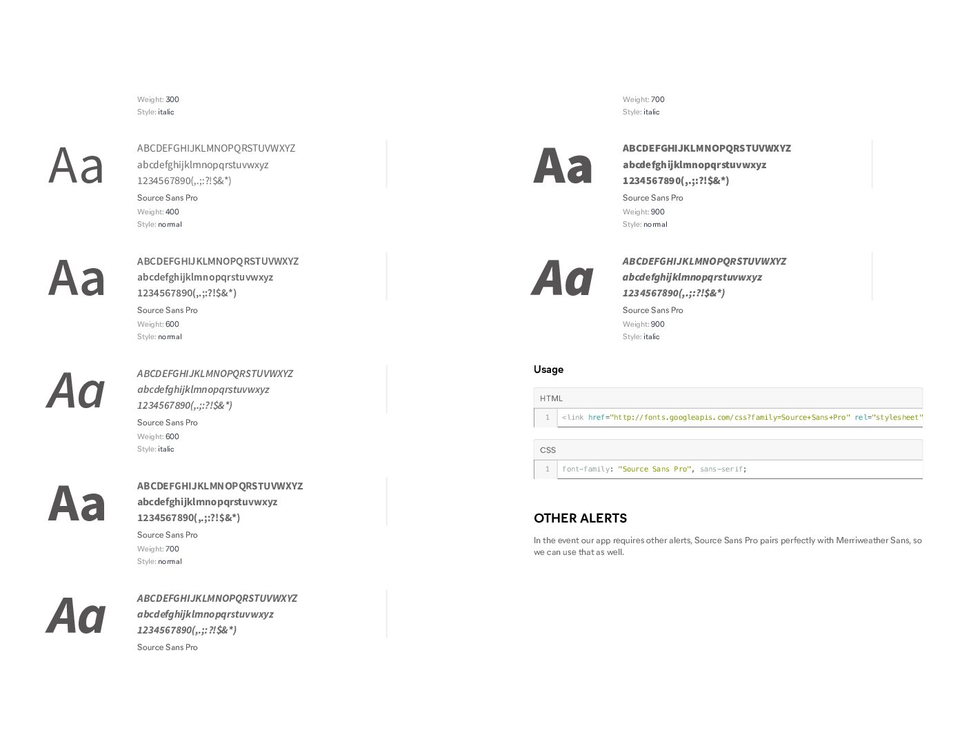
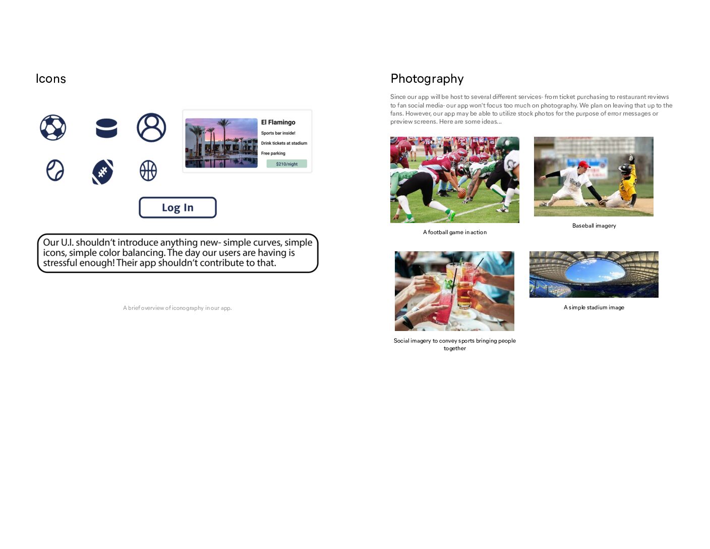
DESIGN GUIDE
After figuring out how to ensure our users could move through our app with ease, we decided upon final design choices.
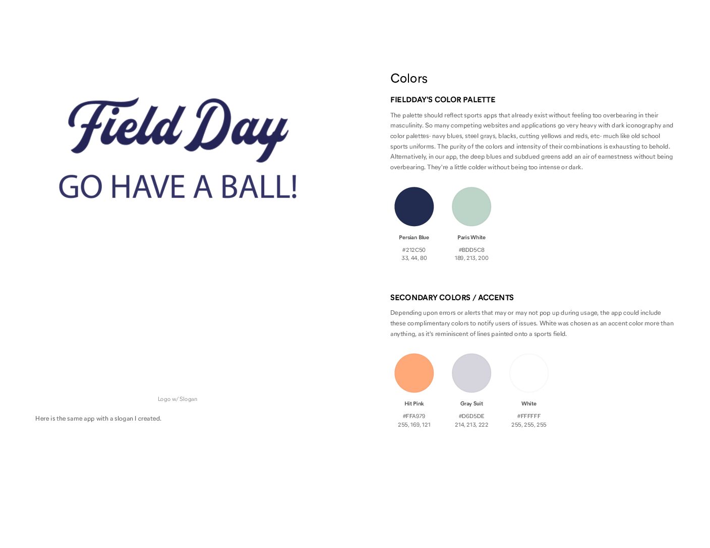
Since 4/5 people in our group were not big sports fans, we wanted the app to have a very specific feel to it:
- It needed to look sporty without feeling too masculine
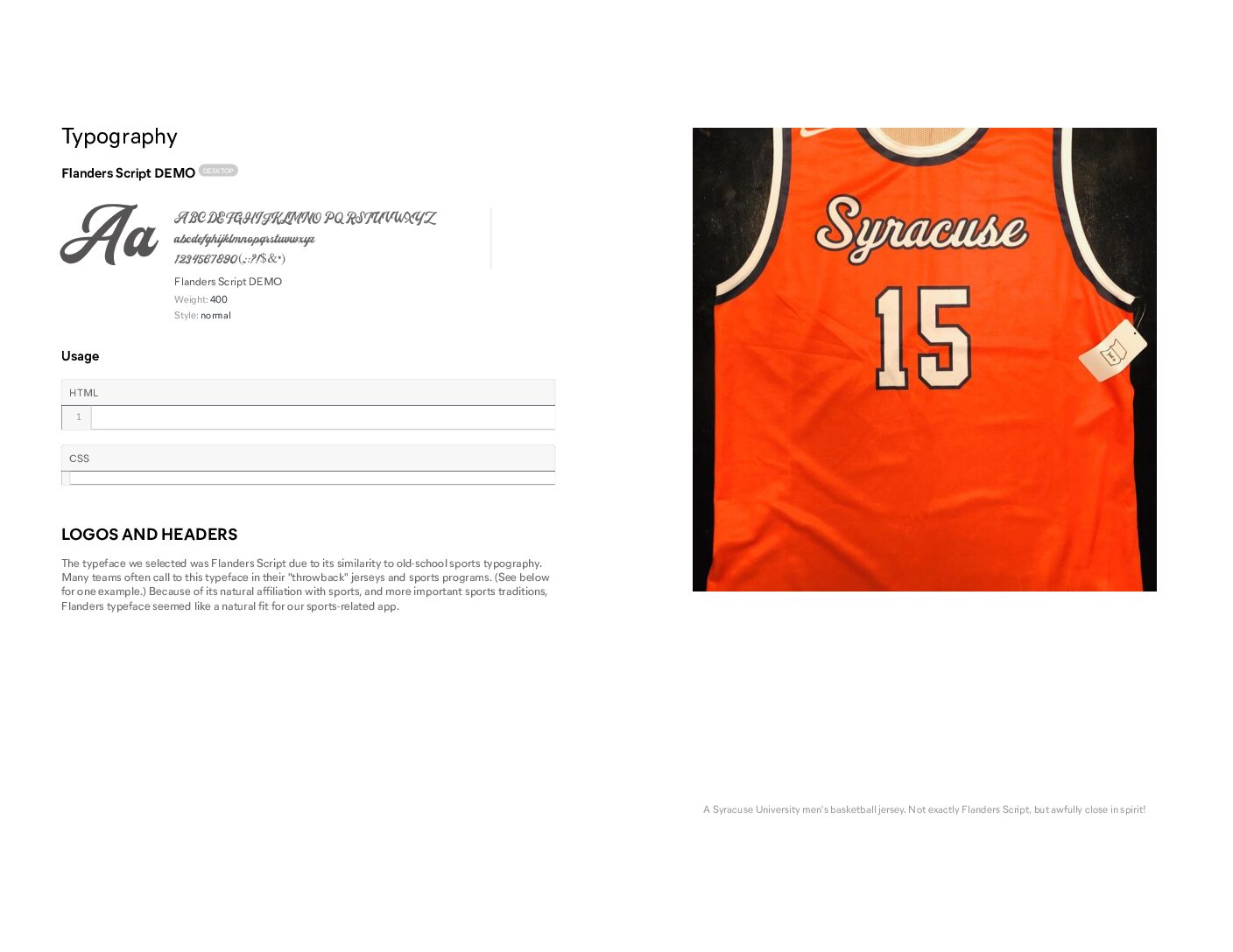
- It needed to echo timeless designs from sports to reflect its focus on sporting events
- It had to use bright and inviting colors while complying with WCAG guidelines
- Finally, it needed to harness appropriate imagery to convey the different ways it can help traveling sports fans
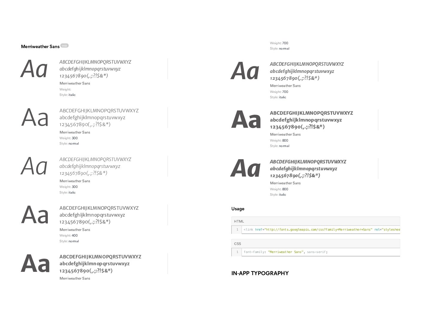
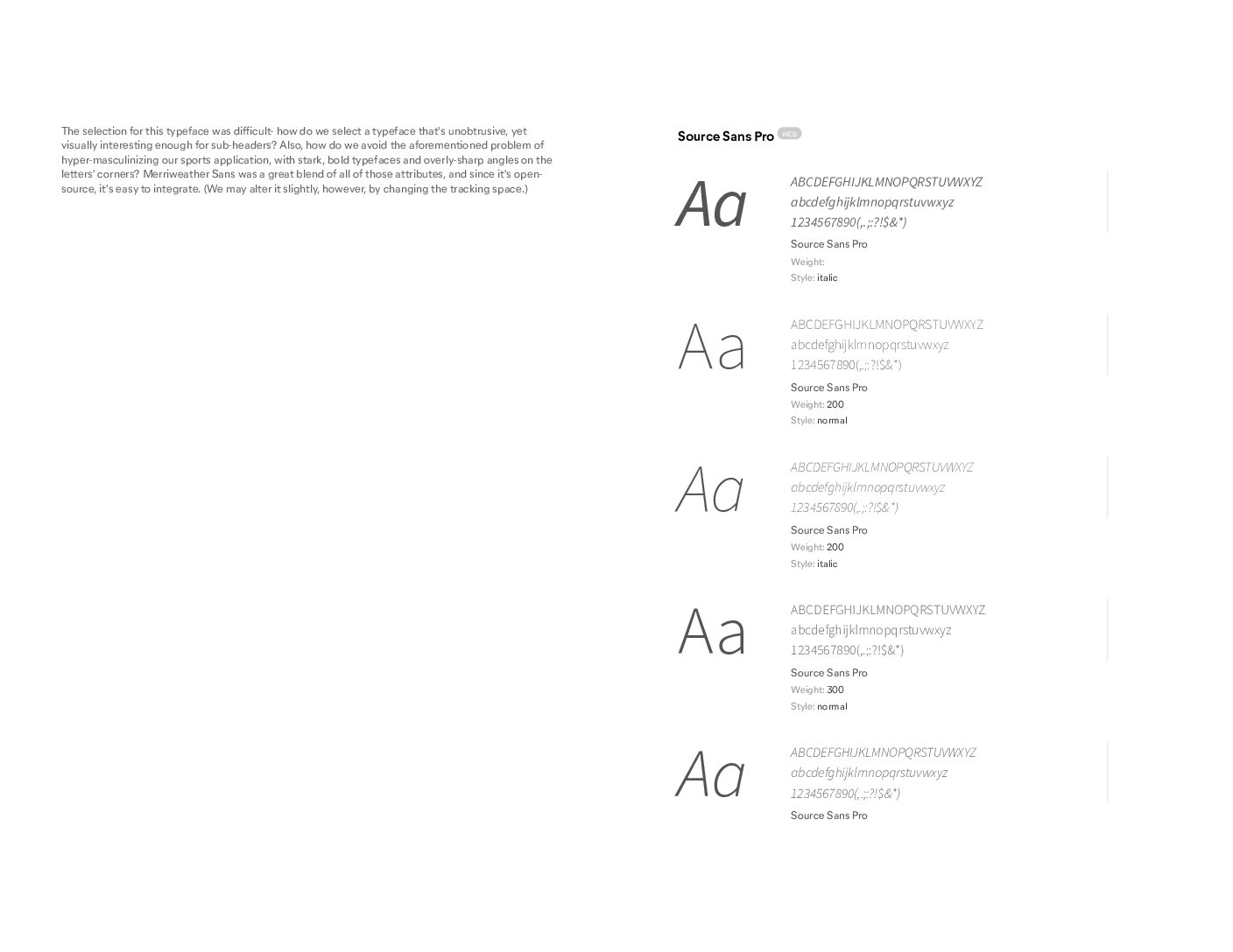
This led to the style guide you see in the following images:
JOURNEY MAPPING
Thinking back to our personas helped us hone in on what would be the most important features to include in our app. From here, my team and I answered questions like:
- WHAT services would users need?
- WHEN would they need it?
- HOW should they be able to access those services?
With these questions in mind, we developed journey maps and simple user flows to determine which features would best work for our prototype, several of which you can see below:
LO-FI PROTOTYPE
Once we had our main user flows in mind and an idea of how we wanted the app to look and feel, we created lo-fidelity prototypes as a proof of concept. At this point, our project was sufficient for the needs of our stakeholders and our work as a team concluded.
However, I recently decided to make updates to FieldDay to make the app look more professional and contemporary.
RECENT PROTOTYPE
Since the lo-fidelity Figma designs were sufficient for my team’s needs at the time, our final project’s UI looked unfinished and could not be marketed as a final app ready for delivery.
While updating the app, I decided to do so with three goals in mind:
- Ensure the designs follow mobile device UI best practices
- Keep the same functions for app users, so it remains an all-in-one platform
- Maintain the same styling outlined in our original style guide.

To complete these updates, I used a community-based webkit provided by Apple to help mobile developers and designers. This expedited my workflow and ensured I need not start from scratch.
After finding that resource, I customized my components to meet my own needs and updated the look, feel, and flow of the app without straying from my group’s original ideas. This included major updates to UI components like menu bars, CTA (call-to-action) buttons and the creation of sections for seat selections in the app.
Finally, I verified that all of my color and typeface selections were WCAG-AA compliant and would not violate accessibility standards.


